The Northern Explorer
Visual Composition & Layout | Illustrator + InDesign | BCIT Term 1
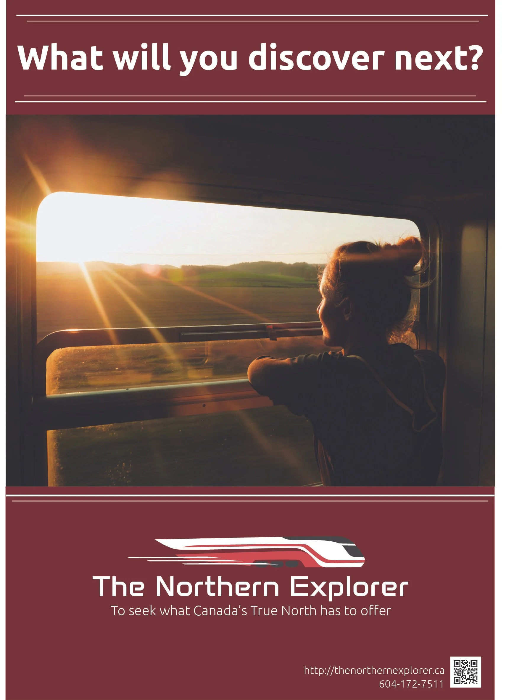
The Northern Explorer is a fictional travel brand developed to promote cross-country rail journeys across Canada. This project, completed for a Visual Composition and Layout course, combines branding, typography, and layout design to create a cohesive promotional campaign.
The design features a custom logo inspired by a speeding train, symbolizing motion, efficiency, and modernity. The color palette—rich reds and crisp whites—references the Canadian flag while evoking passion, confidence, and clarity. Typography was carefully chosen to feel clean, mature, and approachable, aligning with the brand’s values of comfort and class.
Using Adobe Illustrator and InDesign, I created a complete visual identity system along with a promotional brochure showcasing travel imagery, experience highlights, and logo variations. Influences from 1930s Streamline Moderne design helped shape a sophisticated, nostalgic aesthetic.
This project strengthened my skills in visual hierarchy, branding systems, and editorial layout, while giving me a chance to merge storytelling with design strategy.