EARTH ALIGNED
Brand Identity | Adobe Illustrator, Photoshop, InDesign
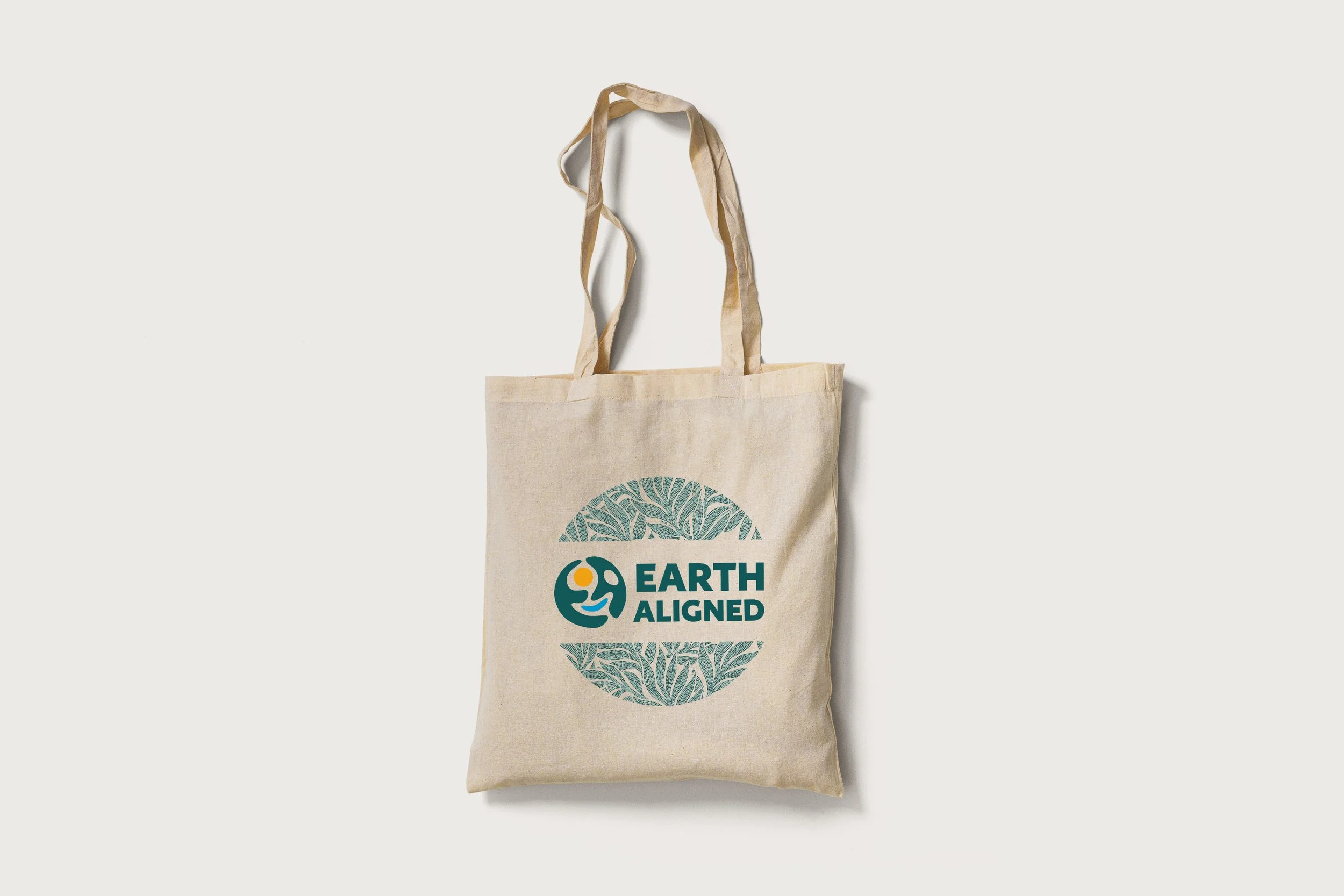
The project EARTH ALIGNED explores a bold, symbolic identity for a wellness or sustainability-focused brand. The circular mark combines human and planetary elements, suggesting harmony, movement, and care for the Earth.
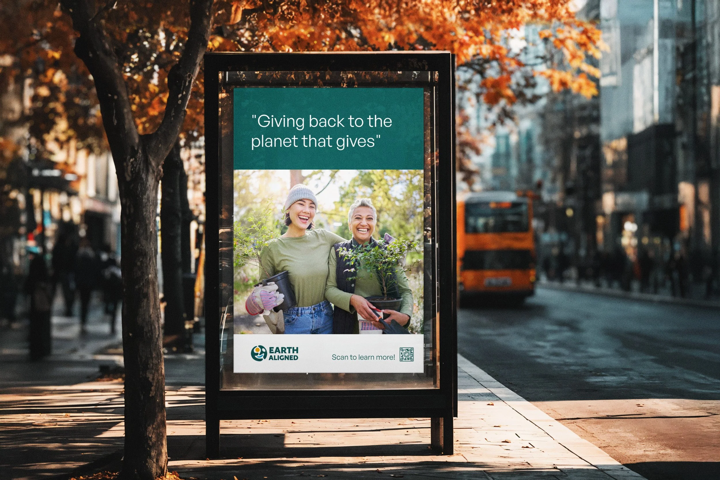
The design process focused on creating a mark that is both versatile and recognizable across platforms. I developed multiple color variations and lockups to ensure adaptability in different brand contexts—whether in digital, print, or merchandise applications.
This project strengthened my skills in logo development and brand consistency, while allowing me to express values of connection, balance, and global awareness through visual form.
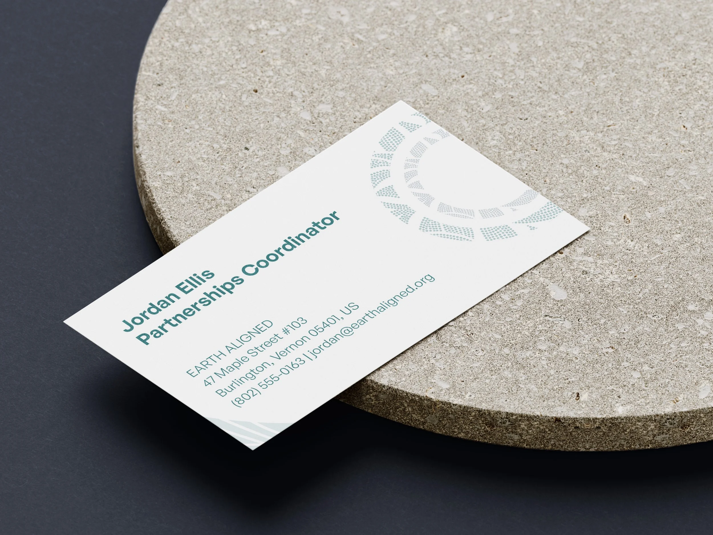
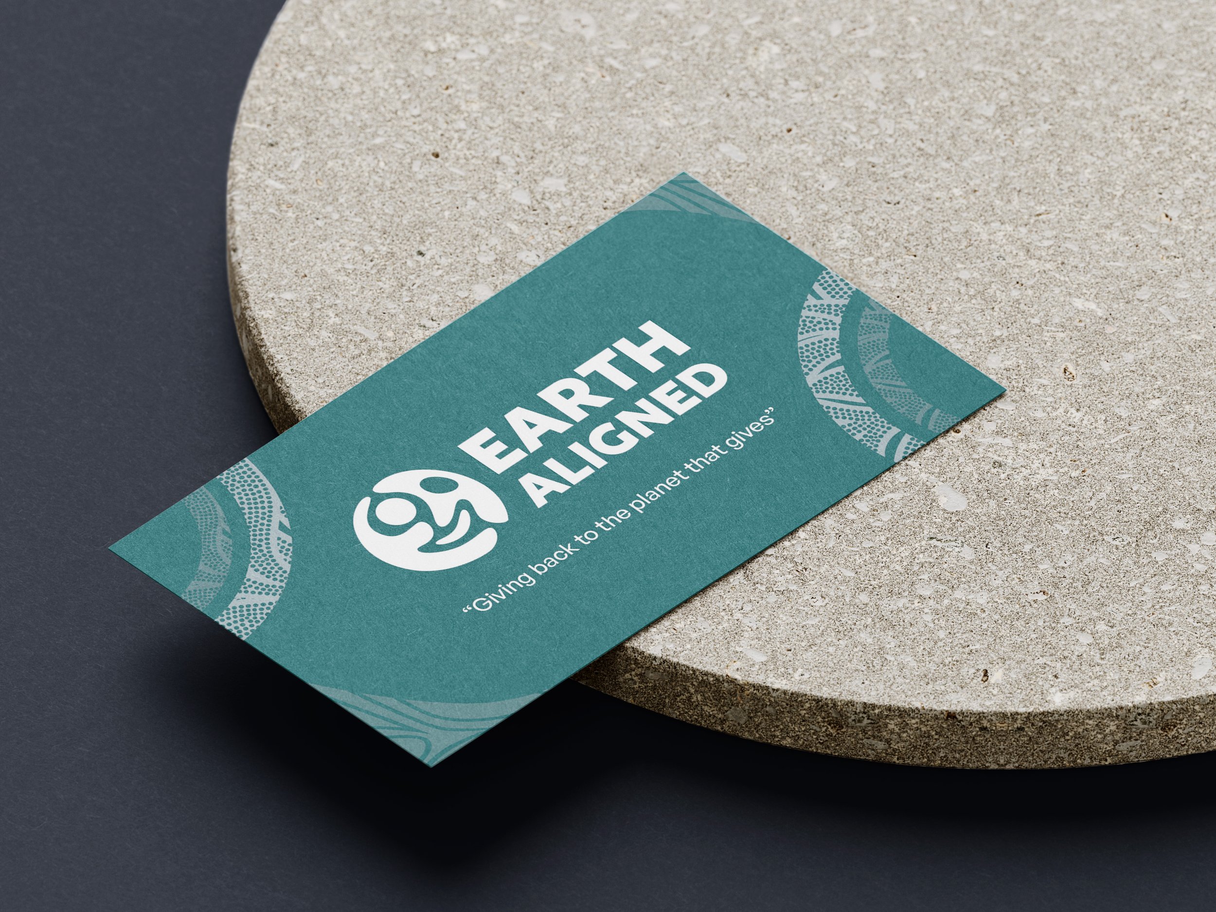
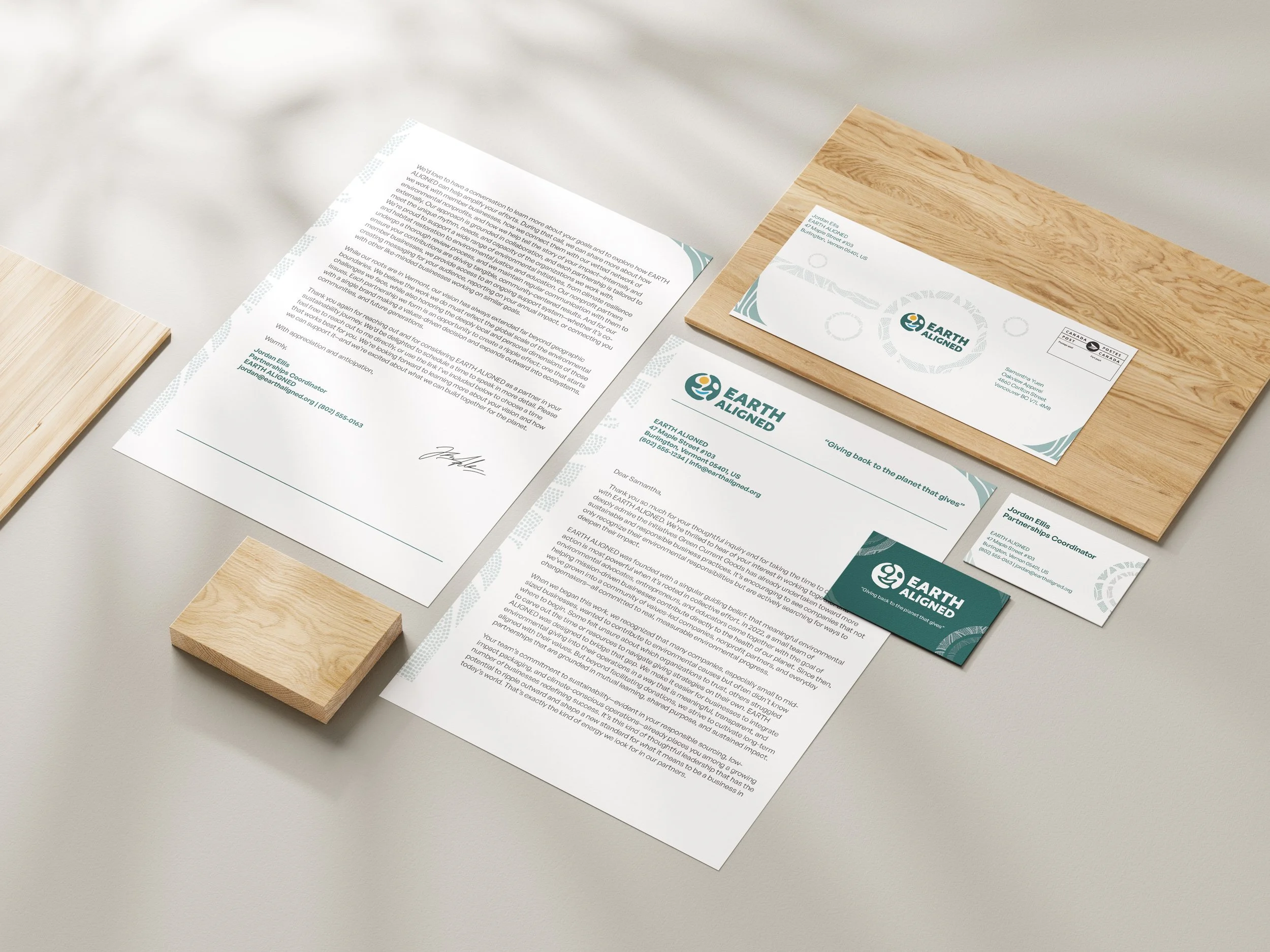
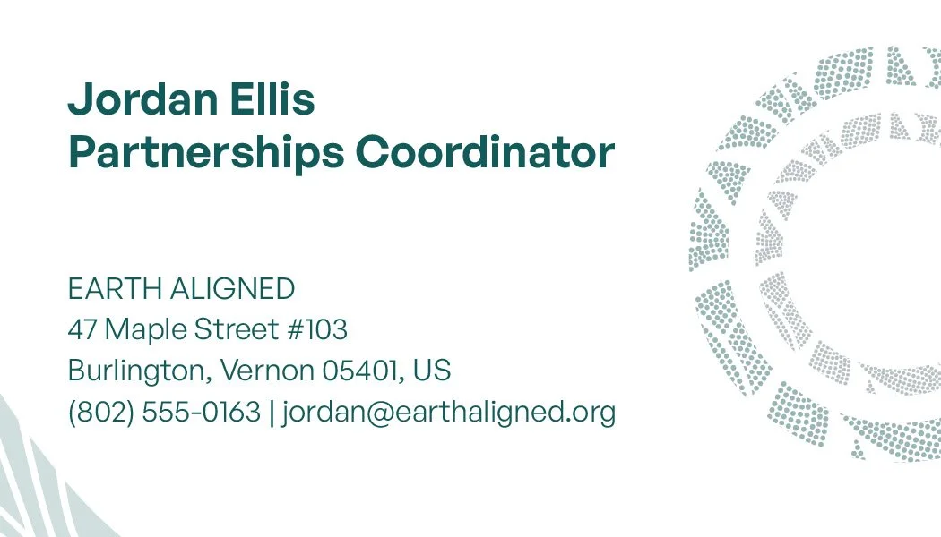
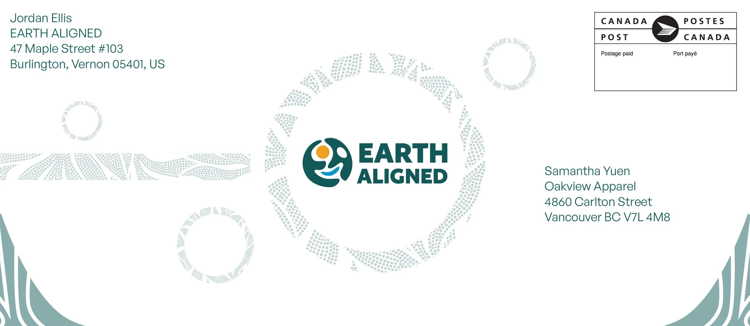
Stationary Package